In the mid-nineties I was design director at Sydney agency Billy Blue Creative. Known for publishing the brilliantly irreverent Billy Blue magazine that championed both Australian writing and art and as pioneers in the private education space, the design agency bit, Billy Blue Creative was gaining a reputation in brand creation. However, the legacy of the magazine still lingered and we were still considered a bit of a boutique design house – All squiggles and primary colours!
Therefore, we were thrilled (if not a little surprised) to be given the opportunity by the Australian Tourist Commission (now Tourism Australia) to pitch for a new visual identity for Brand Australia. The incumbent identity needed to be reinvigorated. We were up against branding heavy weights. Nothing to lose and everything to gain, we were up for the crack!
Back then, creative strategy was provided by agencies that had San Francisco, New York, London and maybe Sydney offices listed on their stationery. Lengthy and expensive (often creatively soul sucking), this was not part of Billy Blue’s creative offer. Our strategy was to trust our gut… and our collective gut was saying, “No Kangaroo!”. Why? Qantas had one. Austrade too. Duty free stores along the length of George Street had them. We wanted to create something more experiential. Less iconic. Less expected.
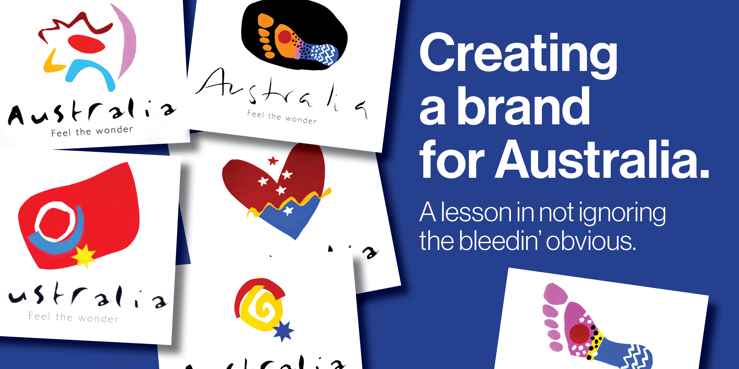
We defined the territories ‘Our place on this world’, ‘Our unique culture and climate’, ‘Casual under the sun’ and ‘Touching the wonder of Australia’.
We drew Southern Cross stars, gum leaf inspired squiggles, red centres and rock paintings. Sun with surf, Southern Cross with hearts and magical footprints in the sand were also developed. All were underscored with the working tagline of ‘Feel the wonder’. We went, we presented, we left feeling pretty happy.

A couple of weeks passed. The phone wrang. We answered…
“It’s good news Billy Blue, you’ve got the job… but we’d like a kangaroo please!”.
Our collective guts must have been a bit dickie that day as it was revealed that global research conducted by the ATC highlighted that the kangaroo was the most recognisable symbol of Australia (Duh!). Brand Australia was going to be out there with Qantas as a global tourism brand, one rarely seen back home. Adopting the Roo as its symbol was a bit of a no brainer.
The committee had been impressed with our enthusiasm, chemistry, a genuine keenness to work together and a willingness to bravely (or foolishly?) ignore the bleeding obvious.
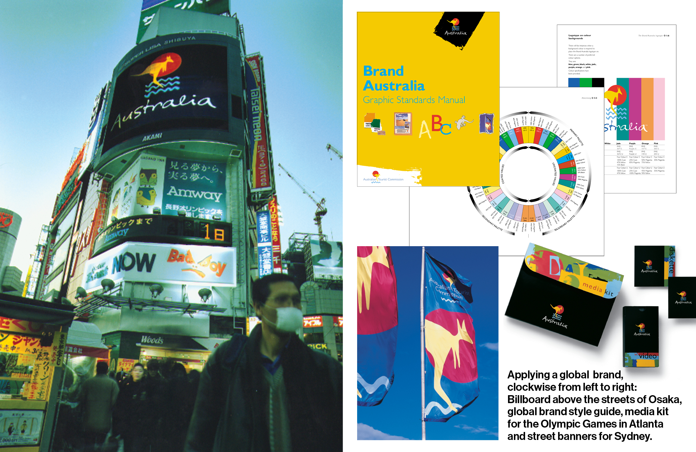
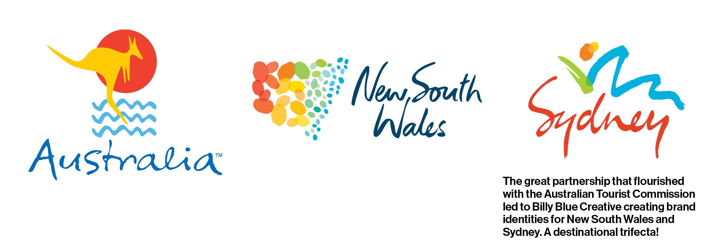
So, kangaroos were drawn hopping and bounding. Logos were settled. Colours and type palettes were evolved and finalised. Global guidelines were produced and Brand Australia was launched globally. Billy Blue liaised with ATC’s advertising partners. Our street banners graced the streets of Sydney and we created Brand Australia collateral that was distributed at two Olympic games. This partnership lasted for many years and led to Billy Blue Creative redesigning destinational brands for New South Wales and Sydney*.

So? Is Tourism Australia onto a winner with Ruby the Roo? For sure she’s in the ‘obvious bucket’ but the campaign will immediately be seen as an invitation to come Downunder by potential visitors. She’s friendly, cute, welcoming and uniquely Australian. As one who has experience in trusting a dodgy gut over strategic insight in a previous life, my fingers are crossed that Ruby will entice the crowds to return to experience the wonder that is Australia and help resurrect our suffering tourism industry.
*In recent times the destinational brands for Australia, New South Wales and Sydney have been refreshed.


