For a creative agency, self-promotion and the pursuit of market differentiation can, and should be, none stop. Award and new business wins need to be celebrated, new hires announced to those who care and a capabilities promotion strategy needs to be defined – Online (socials, podcasts, website etc), in print (trade and mainstream press, targeted mail-out campaigns), environmental branding, new business tenders, event sponsorship… I know, I know, I know YOU know!
To be seen in the right place at the right time and stand out with a unique point of view can be creatively challenging. But nailing it can also be the most rewarding.
Back in the day, when old mate co-ran creative upstarts, Billy Blue Creative, we started to wonder if the business had an identity crisis. As part of the Billy Blue Group, BBC’s individuality as an agency had become muddied. As we courted new clients, first questions would invariably be “Aren’t you a school?”, “Do the students do the work?”, “Is the magazine still going?”, “Don’t you teach catering?”. Sighhhhh!
Too many brainstorming hours were invested (aka wasted!) to determine and define our unique point of difference, our persona, our bloody USP! Some ‘advisors’ thought it was time to change our name and adopt a more digital looking identity. Bollocks to that! We realised that our point of difference was that we were part of the world’s smallest conglomerate! Pioneering, entrepreneurial, maybe a tad schizophrenic but totally unique. After all, where else could you find a design company named after a criminal? *
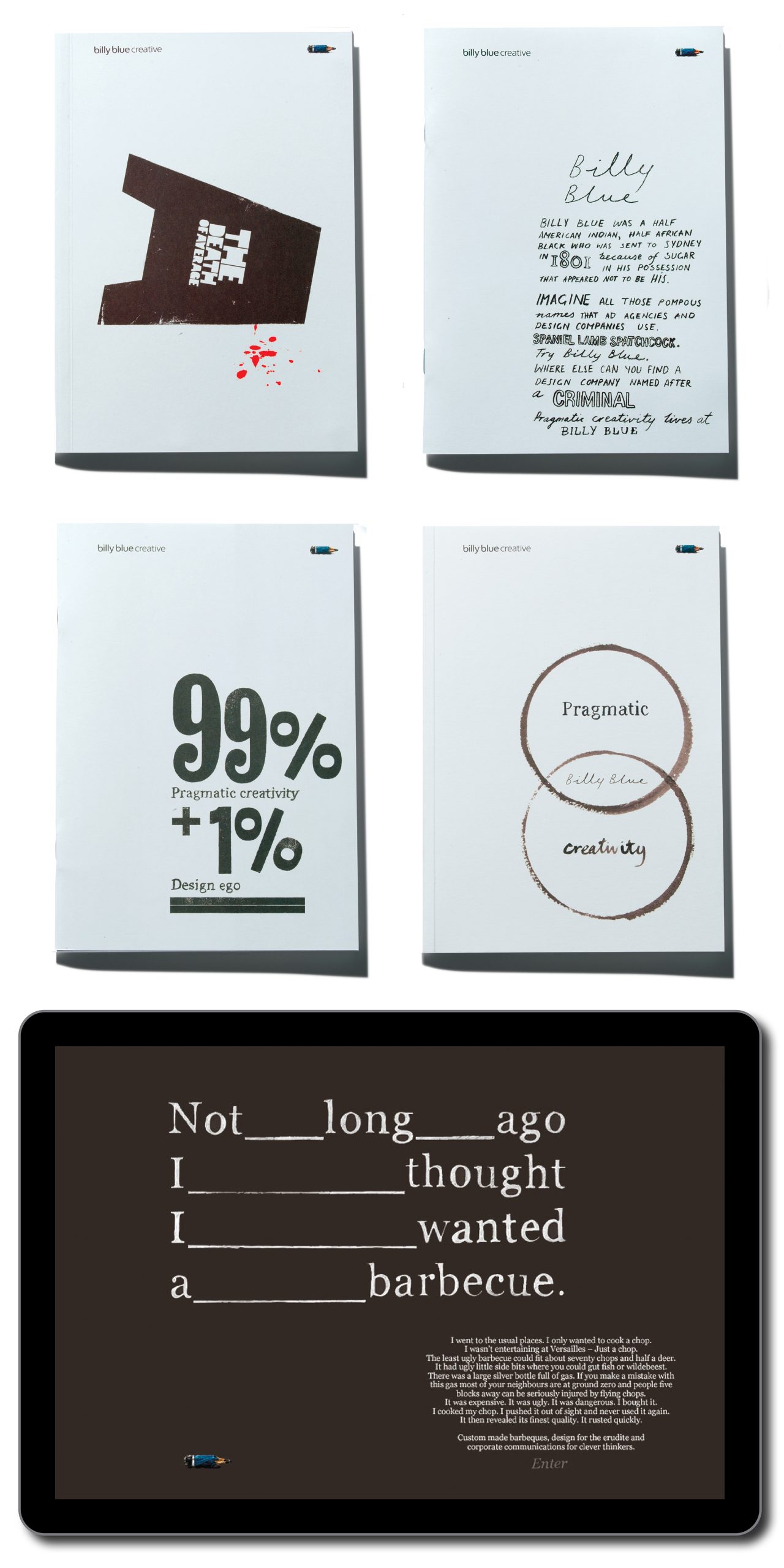
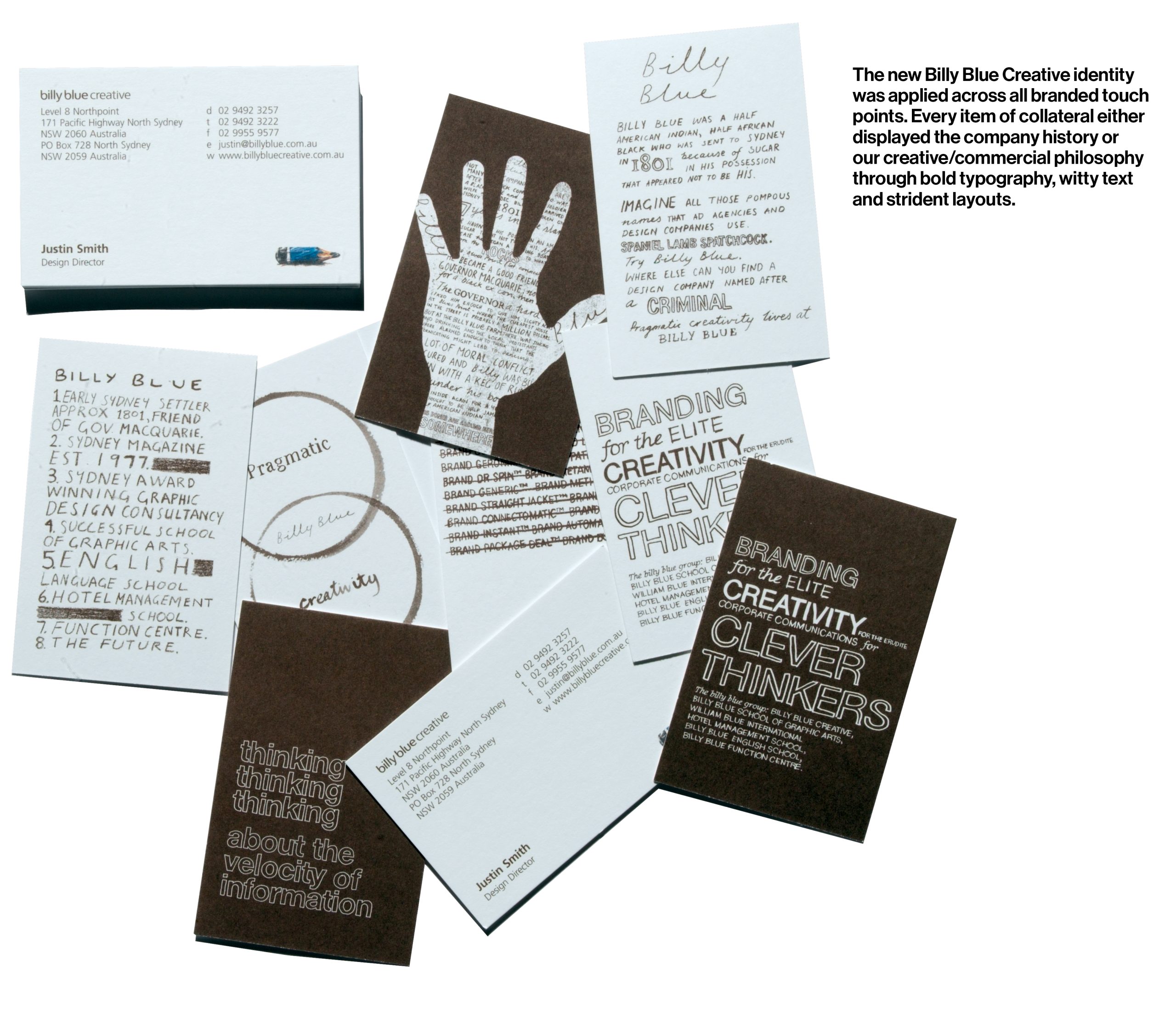 We adopted and adapted the larrikin and irreverence tone of Billy Blue magazine when we described who we were, what we did and when telling the Billy Blue story. It was also an acknowledgement to the founding partners, Ross Renwick and Aaron Kaplan, who had a mission statement to lose money and have fun!
Our branded material led with copy that gave a quick history of Billy, the man/group, or voiced our philosophies on creative pragmatism. A library of brochures was published, each focussing on different core competencies of the agency. Each were written in short story style with examples of our commercial work punctuating the editorial when relevant. We steered away from the usual design agency terminology choosing more lyrical titles instead. These included, How to catch fish (An angler’s tale about the great clients who didn’t get away), The Death of Average (Highlighted the dangers of playing it safe in marketing) and The Dog from Hell (A book for the lucky person who has to manage the annual report this year). This another nod to the editorial policy of the original magazine.
This approach carried through to online and stationery. Each of us had a suite of several different business cards. Clients loved them and insisted on a new card at every meeting to complete the set. Brand headlines or graphics were rendered in a loose style giving more relevance to the blue stubby pencil that had served as the agencies symbol for nearly two decades.
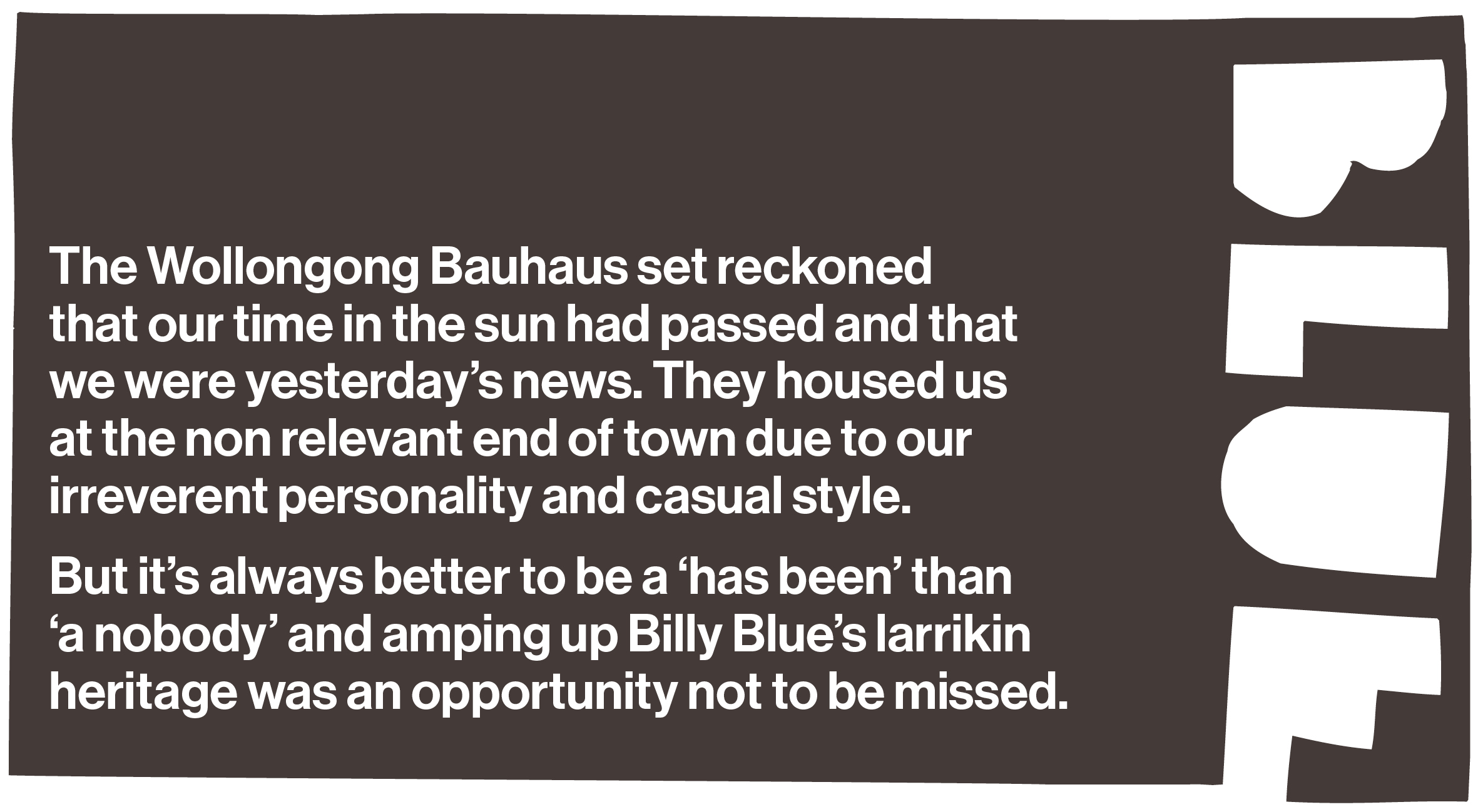
A year or so before we had developed a similar aesthetic when re branding the Billy Blue Schools campus. Here we were able to enhance the look and feel by applying messaging and graphics at large scale and by utilising various architectural/material finishes and embellishments.
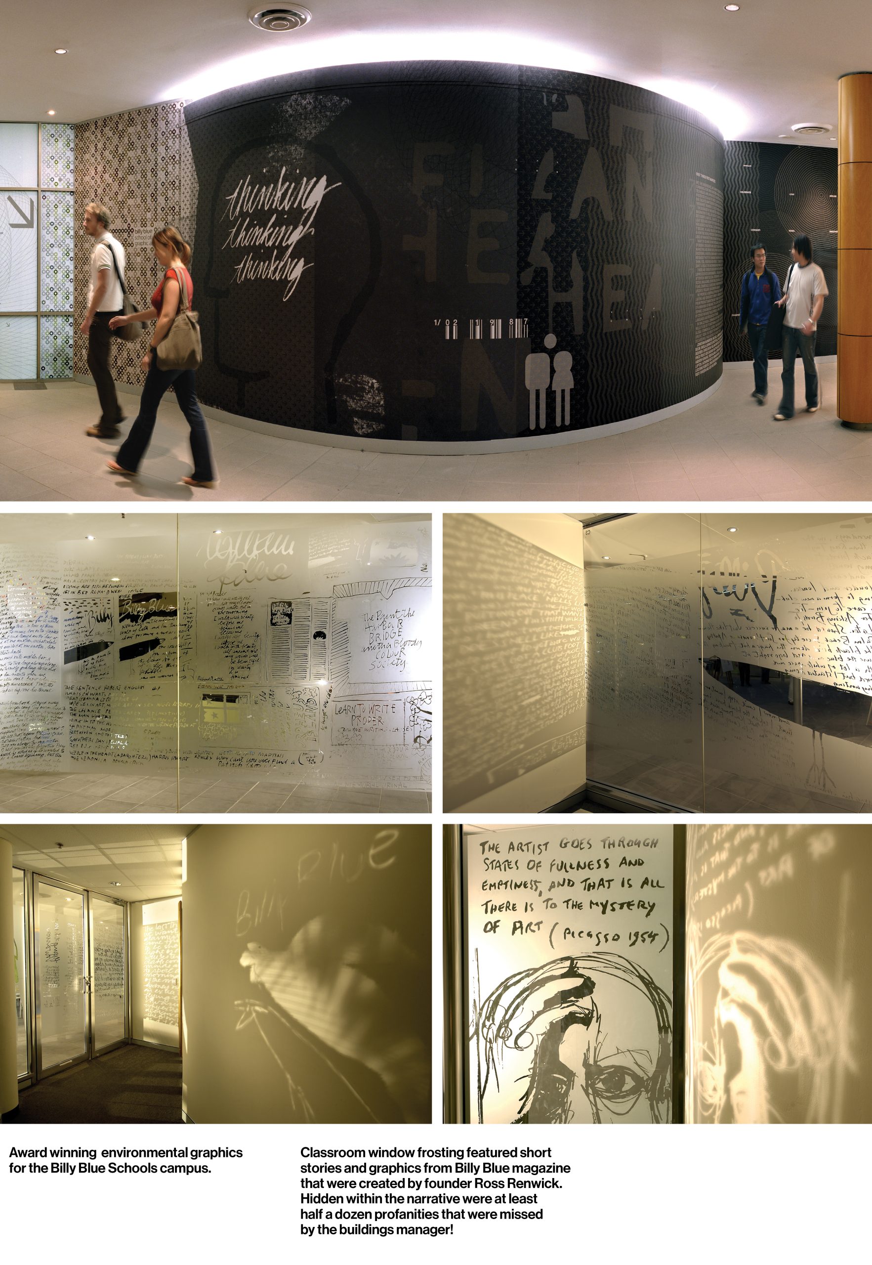
Billy Blue Creative’s revitalised brand not only helped to win a bucket full of new business but also featured in several international design publications, snagging a few awards along the way. We were stoked when the environmental and wayfinding design system of the school campus was awarded pinnacle at the Australian Graphic Design Association awards.
These astounding results were due to an outstanding team of talented individuals who applied their creative chops and craft and who totally ‘got’ the relevance and overall objective of the brand.
Creative lead, Justin (Design Director) Smith, constantly demonstrated how our new brand could flex, keeping it fresh, exciting and relevant. It was thrilling to witness how his genius could make it sing. The chip paper that wrapped the booklet How to catch fish is still a favourite of mine. A shout out also to Sinead (Designer) McDevitt, Ross (Co-founder and copywriter) Renwick, Dean (Brochure copywriter) Thomas and to all of the account managers, artworkers, photographers, specialist printers and signage partners that contributed to making it such an exciting project to be involved with.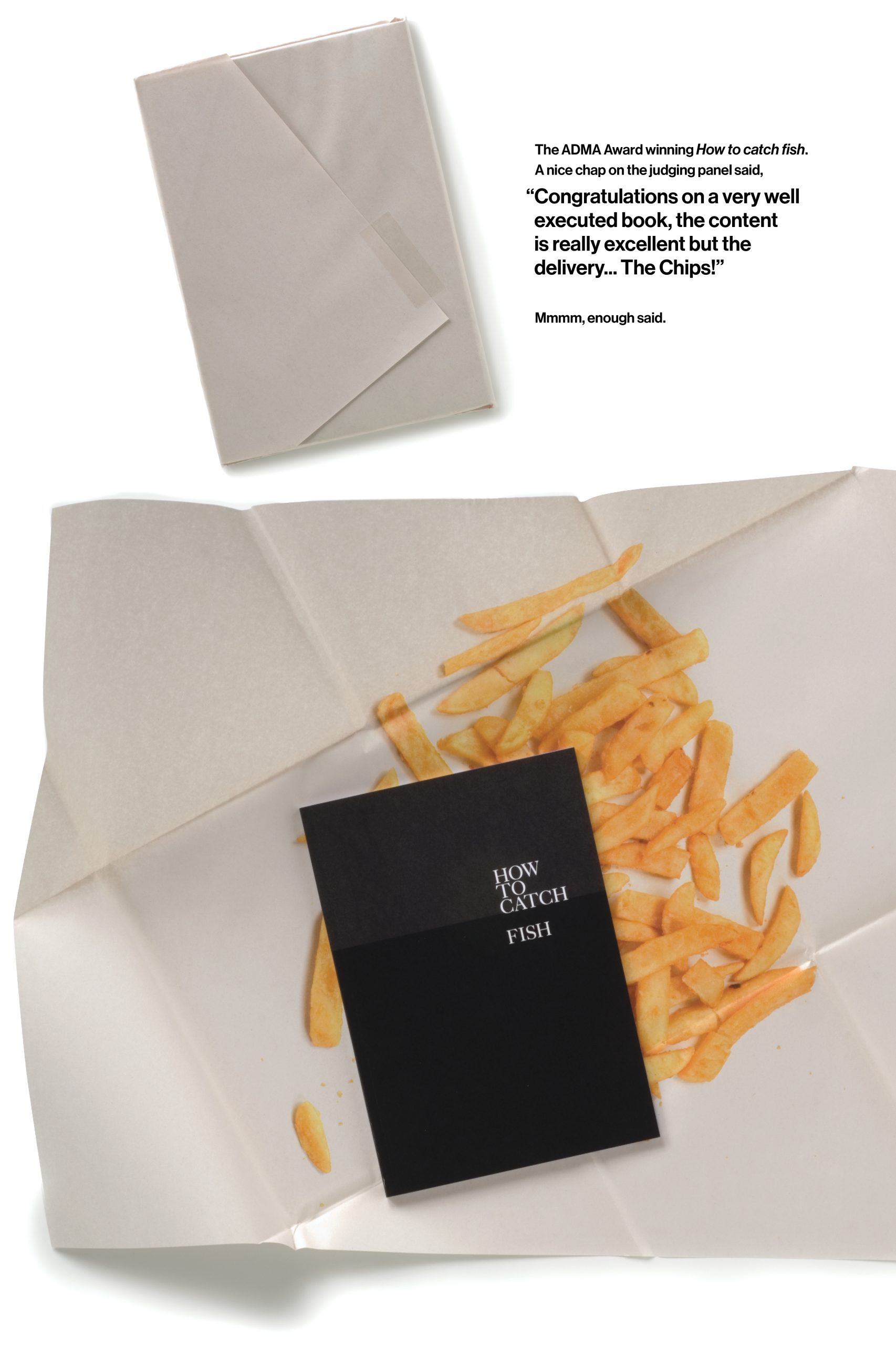
Billy Blue’s colourful history, irreverent and entrepreneurial spirit plus a creative reputation gave us a strong platform to build on. Maybe that’s why one of the business cards defiantly announced: Billy Blue. Branding without the bollocks!
*The convict who became the world’s smallest conglomerate
1801 – Billy Blue the man arrives in Sydney
1977 – First of 106 issues of Billy Blue Magazine published
1980 – Billy Blue Creative, award winning graphic design agency, established
1987 – Billy Blue School of Graphic Arts opens for business
1990 – William International Hotel Management School established
1995 – Billy Blue English School opens its doors to overseas students
1996 – Billy Blue Palace Student Hostel opens

