I must confess that I’m rather drawn to the looser end of town when it comes to typography. I don’t profess to be a type designer, but I’ve given it a go. I’ve daubed words with an ink dipped, gnarly stick, stamped headlines using cut potato letters and carved alphabets from grubby erasers liberated from the studio stationery cupboard.
Just to go off piste, for some years I’ve been collecting ‘found bits’ on the street. Usually it’s small, metal objects preferably in a rusty condition. Sometimes it’s not. I have fashioned faces from this rusty detritus and christened them Throwaway Friends. Many think I’m a hoarder. A few see it as a creative outlet. Others reckon that I should seek treatment!
Being a bit of a type geek, some of these ‘found bits’ have inspired me to create letterforms and even whole alphabets. My typographic musings are also inspired by other random influences. Staedtler erasers. Information symbols and graphics on discarded cardboard boxes. Those pesky, sticky, colourful fruit and vegetable labels. Even cracks in the pavement and damaged brickwork have all provided inspiration. Mmm? Maybe those people are right? I should seek treatment!
But I’m not alone. I think that we’re living in a typographic boom.
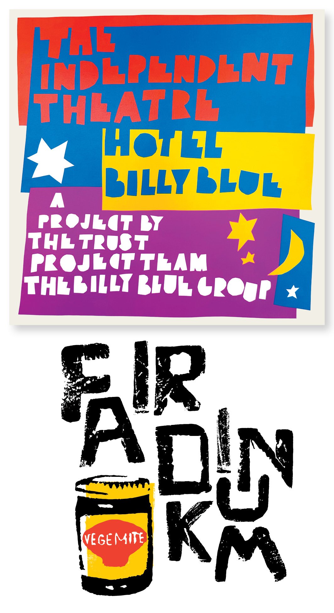
My first job when arriving in Sydney was at the Billy Blue Group, the publishers of the iconic Sydney magazine, Billy Blue. The company had a larrikin attitude and a reputation of being irreverent and colourful. If Billy Blue ever had a mission statement it was to ‘Lose money and have fun!”. And we did.
The casual and loose style of the Billy Blue magazine and editor/founder, Ross Renwick, profoundly influenced my attitude toward design and typography.
In an environment of “F**k it! Let’s try it!”, to ‘play about’ was definitely encouraged.
Sometimes I’d use scalpel and paper or even potato cut lettering to create unique looking typeforms. Shown is a promotional brochure produced for the fledgling Billy Blue Group empire and a type led theme pitched to Tourism Australia.
The latter was part of a bigger poster suite celebrating Australia’s unique tastes, language and casual personality to visitors here for the Sydney Olympics.
Typographica is back. Type is looking sexy. Type is expressive. Type is heroic. Type is human. Type is fun. Type is appreciated and being collected. Type is hung in galleries, painted on walls and inked on skin. Multicoloured, stretched, condensed, spaced, animated, the young Turks and the old guard are crafting and creating typographic ‘art’ that is simply astounding and oh so inspiring.
‘Hand done’ typography is part of this idiosyncratic, bold, beautiful and inspiring wave. Type art, full of verve and character (no pun intended!) is being created with paint and brushes, pen tools and trackpads, scalpel blades, black paper and scanners. It’s leaving a huge impression in the world of typography, and on me. It’s so cool!
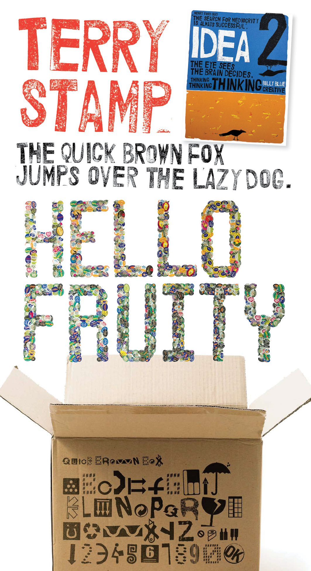
I confess that sometimes the inspiration for my typographic endeavors have been eclectic.
Terry Stamp is carved from Staedtler erasers. It snagged ‘Finalist’ in that years AGDA Awards. Stoked!
Old Fruitiger, an alphabet made from plasticised fruit and veggie labels, was initiated in an effort to keep those, pesky, non degradable stickers out of my worm farm!
Quick Brown Box is inspired by a symbol on a cardboard box I was recycling. I saw it as an abstracted ‘A’ and three years and many recycling bins later, the alphabet was complete.
Like the small, rusty metal objects, I have collected a very long list of those who inspire and fuel the fire in mine and countless other bellies to look beyond the common and to create something uncommon. Some of the notables on my list of fire starters include Andy Ashton, Emma Bers, Patrick Brill (Bob and Roberta Smith), Gemma O’Brien, E. Linda Sullivan, Kris Andrew Small and the guys from Spin Studio. Rockin’ it!
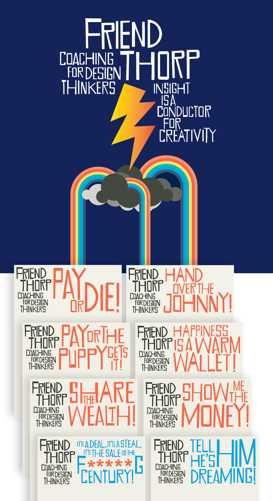
For my coaching and design business, Friend Thorp, hand cut lettering marries perfectly with illustration and contributes to the creation of a message led visual identity that has personality and a strong dose irreverence.
Shown is an example from the brands visual language suite and my not so subtle, invoice and estimate templates.
I still dabble in the ‘hand cut’ and have recently used this aesthetic to develop a visual language for my own business. I did wonder if this style was appropriate but as someone once said,
“You’ve got to live dear boy! This s**t’s supposed to be fun!”
And fun it is!